Book design & alternate covers
Anile Prakash and I worked closely (though virtually) for a year and a half on the layout of The Beatin’ Path. One of our first decisions was the font itself. We were fortunate to discover and receive permission from David Jonathan Ross to use his new font, Fern, which seemed a perfect fit for the style we were aiming for. My thought was that the layout should be “timeless but fresh,” a la Cirque du Soleil, which, like Anile, is based in Quebec.
She quickly identified some rich and barely-tapped sources of potential graphics, including The British Library’s collection of public domain images — many from the 19th Century, which was a Golden Age of illustration. We spent hours scouring the archives; anyone who has done this knows the euphoria of finding the perfect image. Unlike a more typical browse through a contemporary stock photo library, we were constantly astonished by the skill of those artists, and the power of their art to communicate compellingly, anew, with generations unborn when their work first saw the light of day.
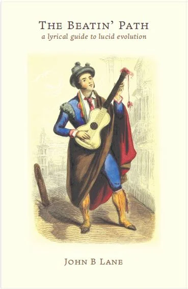
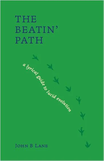
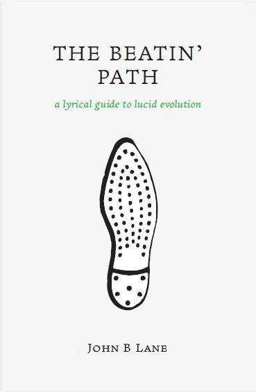
Every week, Anile shared her fresh layouts, and we took time with every decision that was made. I think it was a bittersweet moment for both of us when the interior of the book was finished, because our collaboration was such a joy. But the cover remained, and we hadn’t really discussed it along the way. The image of the guitar player on the left (below) was one that we’d come across in our search for other images, and it stuck in my mind as something that might work for the cover. The other two were Anile’s concepts. I especially liked the middle one — the bird tracks were whimsical, and I liked the green and blue and the meandering subtitle.
But none of them quite seemed like the cover. However, Anile’s use of images from inside the book directed my thoughts toward things we’d already used. A few days later, I woke up in the middle of the night, and started thinking about the cover. The final image came to me quickly — to “evolve” the sunflower that appears in “Wings, That I might Walk” (the original botanical drawing from 1713 has astonishing detail) by making the petals multicolored and adding an eye peering out of the center.
Anile liked the idea and the sunflower you see on the final cover was the only version I saw — I loved it immediately, from her color choices to the Warhol-esqe irreverence for coloring outside the lines. I showed it my son Adam, who said, “Don’t do anything more to it, Dad — it’s done.” (You can see it on the Global Arts page.)
I was fortunate to collaborate with Anile on this project. She is a beautiful soul and an exceptional designer. These layouts provide a glimpse of our creative process.